Integrity House
Integrity House believes that no matter what a client has faced outside their door, entering into a program means receiving whole-person, compassionate care from their team of addictions specialists, healthcare and mental health professionals, and more.
When individuals facing substance use disorder or mental health challenges require compassionate care, they turn to Integrity House. The organization has been a trusted source in the field since their founding in 1968, and their goal has remained constant: to provide clients with comprehensive, whole-person care options under one unified system of care. By offering a wide range of services to clients, Integrity House helps those in need find the right programs that can help them on their journey of sustainable recovery. Their nimble team, dedication to clients and focus on innovating allows them to explore new, promising strategies and incorporate evidence-based practices. Integrity House is committed to responding to the needs of their target population as they arise and prioritize our relationships with clients, to better understand the barriers to care they may face.
Overview
Visual Identity
Logo Design
Print & Digital Collateral
Project Credits
Agency:
Second Melody
The Brief & Overview
Integrity House's brand identity was a bit dated and lacked the contemporary energy that the organization and employees embody.
Instead of offering to merely extend their current identity, we revitalized the brand from the ground up. We began with an in-depth discovery phase, which brought their true identity to the surface. With a clear understanding of the organization, we developed a verbal identity that aligns with their mission, vision, and values. Lastly, we designed a new logo and visual identity that complements the verbal identity.
The Discovery & Audit
Early research into the organization was conducted via interviews and an in-person brand workshop. The discovery phase culminated in a brand audit report, which outlined the current brand, industry peers, and evaluated brand assets, concluding with suggested opportunities for the brand.
The Verbal Identity
The Integrity House brand is defined by three unique keywords that describe the organization and set them apart from peers: Nurturing, Steadfast, and Comprehensive. We call these Brand Guideposts and they direct every brand decision Integrity House makes.
The verbal identity also consists of a positioning territory, a positioning statement, archetypes, brand voice, brand ethos, and key messages.
The Logomark
The sun is a universal symbol of hope, renewal, and new beginnings, aligning with Integrity House’s mission to provide a fresh start for individuals seeking help and support. The circular shape signifies wholeness, continuity, and completeness - suggesting a holistic approach to care and support, where every aspect of an individual’s well-being is considered. The circle also represents a protective boundary - a safe space where individuals can heal and grow without fear.
The Visual Language
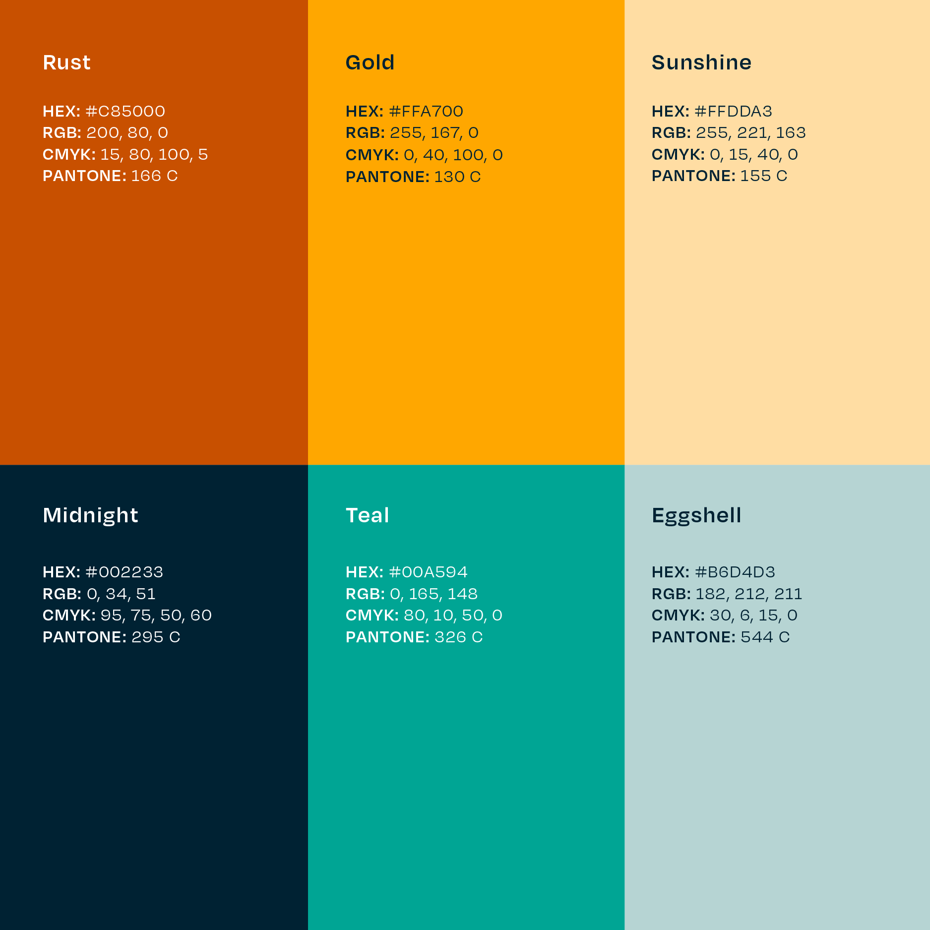
Integrity House’s visual identity is underpinned by two contrasting emotions: empathy and grit. We personified these with a careful selection of vibrant colors that are muted, yet hopeful. Graphic assets such as hand-drawn underlines and imperfect circles denote a human element.
The Result
Integrity House now has a cohesive brand identity that accurately portrays the organization’s mission. The identity provides potential donors, service seekers and their families, government and industry officials with a new brand association: Integrity House is progressive, leading the charge and not behind in the times.


